On SSL/TLS and HTTPS — Briefings for my Computer Security class
Brief: This is a technical briefing I made for fellow students in a Computer Security class (Winter 2011) about Secure Socket Layer [SSL] (now Transport Layer Security [TLS]). These briefings fit in nicely since it came after Dr. Obimbo explained the number theory behind RSA (modulus prime exponentiation). I went to the primary source on this topic to write this document: thanks to the Internet Engineering Task Force. I’ve posted this document as a consumable reference for anyone who needs it.
>>> Download: A Network Security Spotlight on SSL/TLS and HTTPS (pdf) <<<
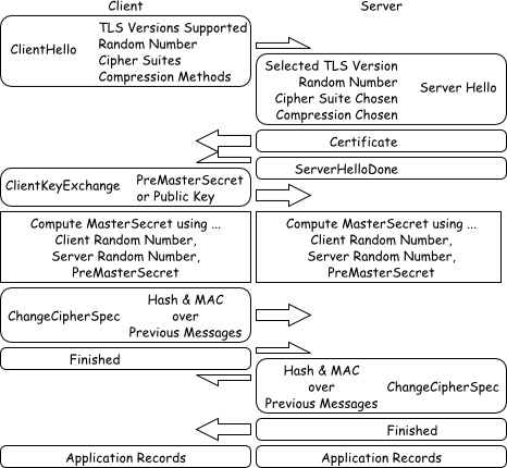
Figure $_: A Schematic of the SSL/TLS Handshaking Procedure.
This document is licensed under Creative Commons Attribution 3.0 Unported. The enclosed figures are further released into the public domain.
Fuzzy c-means for greylevel image segmentation
Here’s a script I threw together to do grey-level segmentation using fuzzy c-means. This appeared as a small part of a project in the image processing course I took. The algorithm deployed was really a proof of concept meant to replicate and verify the results of another author — as such, I don’t recommend ever using fuzzy c-means for this task as it’s pretty inefficient. This software will handle any number of grey-level-segments you desire, but I recommend eight as a maximum.
The code and course project paper are originally dated April 20th, 2011.
>>> Download: FCMProjectPaper.pdf | FCMProject.tgz <<<
( Requires pypng — Python PNG encoder/decoder )
Here are the examples included in the above archive. I like pictures.


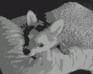
Sunny in 8-bit greyscale, 3-bit greyscale, 2-bit greyscale.


Auryo in 8-bit greyscale, 3-bit greyscale, 2-bit greyscale.
Enjoy 😀
My talk at Barcode of Life, Adelaide (2011)
I’ve just finished my presentation in Adelaide. This is the first real biology-heavy conference I’ve been to. Sujeevan has brought me along with the BOLD team from BIO in order to present my work — and more importantly — to acquire some resolution about the barcoding culture and its biological significance. The Consortium for The Barcode of Life (CBOL) co-hosted this event with many biodiversity parties in Australia. Another huge group present was the International Barcode of Life (iBOL) project. The Barcode of Life Conference is held every other year and is attended by researchers interested in the concerted international barcoding effort. I presented my preliminary findings with a data analysis session and had excellent feedback — it’s pretty clear where to go next with my thesis! My talk describes the first steps to automating barcode (contig-like) assembly from ab1 sequencer trace files. This talk describes the present need for automation, trends that we can readily detect in currently assembled data and most importantly — detectable patterns in how human experts perform manual barcode assembly.
The full name of the conference is Fourth International Barcode of Life Conference.
>>> Download: ( pdf: EddieMaBOL2011Adelaide.pdf | zip: EddieMaBOL2011Adelaide.pdf.zip ) <<<
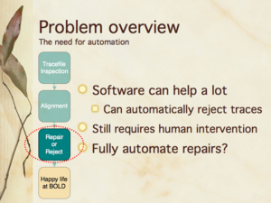
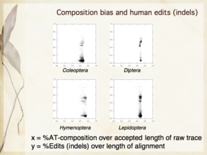
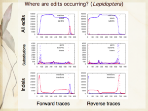
Slides 6, 16, 24 from my presentation — The need for automation; Compositional bias and human edits [null hypothesis]; Where are human edits occurring [in Lepidoptera]?
This has been a very enjoyable conference 😀
My talk at Complex Adaptive Systems, Chicago (2011)
I’ve just returned from the Complex Adaptive Systems conference on Wednesday after an eight hour drive — well, most of the driving was done by Dr. Obimbo and Haochen. I presented my paper An evolutionary computation attack on one-round TEA. This paper is built on top of my course project in Computer Security (University of Guelph, Winter 2011). This is my first cryptanalysis paper, and is an aside to the bioinformatics focus of my thesis.
My slides introduce Tiny Encryption Algorithm (TEA) pretty well, along with Genetic Algorithm (GA) and Harmony Search (HS). The slides detailing the results aren’t quite as self-explanatory, but are bearable since the theme is fairly easy to establish: simpler keys are easier to break than more complicated ones.
>>> Download: CAS2011Chicago.pdf — my presentation from Chicago. <<<
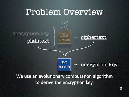
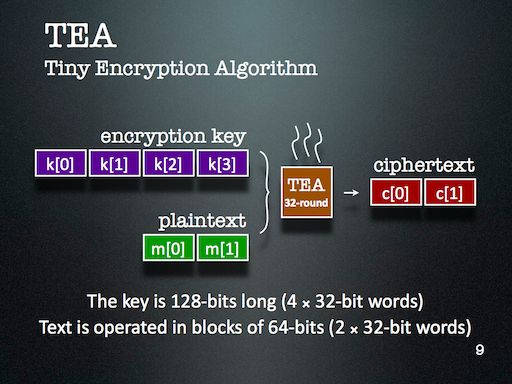
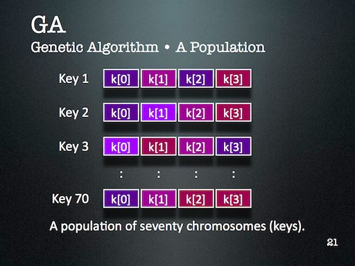
I might look at cryptanalysis again in future — but I’ll certainly use Evolutionary Computation (EC) again. It’s just too readily available in my toolkit, and is far too easy to deploy. One of the major lessons of this project that became very clear through during discussion with the audience is that the operators that are part of an EC algorithm should reflect the kind of problem we’re trying to solve. This might seem obvious at first, but I think it’s more subtle than that. For this project, HS enabled the EC to probe a keyspace with many repetitions — something that GA operators alone didn’t provide us.
In general however, the solution space is lumpy enough that using ECs against stronger encryption schemes is just not viable — unless the EC had some magic to overcome the linearly inseparable lumps. I haven’t yet met such an operator and am not convinced one way or another about its existence. I’ll certainly introduce you if I ever do bump into it 😛
Exposing MATLAB data with JFrame & JTextArea
Today, I’ll describe my first foray into MATLAB. My task is simple — there’s already a GUI developed as a toolbox. The user inputs a bunch of data, and it crunches it away and provides a graph and displays a dialogue box about the moments of the data. The issue here is that we’d like to know more about the data — particularly, we’d like to retrieve the ordered pairs corresponding to each of the plotted points in the graph.
In this exercise, I’ll show you how to use JFrame & JTextArea to display the coordinates of a graph in an already existing MATLAB GUI toolbox or plugin.
The reason why I’ve decided on this approach rather than outputting directly to the MATLAB console is because I eventually want to add additional functions to reshape and reformat the text, and also to save the text that appears in its own window using additional Java swing components. But that’s a story for another day.
The Quick How-To … ( 3 steps )
Choose the toolbox or plugin you’d like to modify and open up its “.m” file. This is where you’ll want to add your custom code. There are three parts to this exercise — first, we need to get a few classes from Java; then, we need to store the data we want to display; finally, we make the display appear.
In this example, I’ll import the bare minimal amount of Java classes — you can extend this functionality by adding more swing classes if you like. I’ve arbitrarily prefixed my Java variables above with the prefix “expose”.
import javax.swing.JFrame;
import javax.swing.JTextArea;
import javax.swing.JScrollPane; // Scrollbars -- optional.
exposeReport = JFrame('Data Report');
exposeTa = JTextArea(24, 80);
exposeScroll = JScrollPane(exposeTa);
exposeScroll.setVerticalScrollBarPolicy(JScrollPane.VERTICAL_SCROLLBAR_ALWAYS);
exposePane = exposeReport.getContentPane();
exposePane.add(exposeScroll);
exposeReport.pack();
I’m not exactly sure why MATLAB doesn’t include scrollbars automatically.
Of the above, there are only two variables which we’ll need to refer to again later — “exposeReport” and “exposePane”.
The next step is to use your JTextArea as an output terminal. Just append strings to it as the graph is being built — you’ll have to look at your specific plugin to figure out the logic behind the graph — in general, you’ll be looking for a for-loop and a function that alters the graph.
// Look for a 'for' loop with a line that adds data to the graph.
// Here, I've used the variable SomeX for a point's x-coordinate,
// and SomeY for a point's y-coordinate.
exposeTa.append(sprintf('%d\t%d\n', SomeX, SomeY));
The loop spins around and incrementally adds all of the points. Note that I’ve used “%d” as a conversion to numbers expressed in base-ten (including floating point values). This is different from the conversion character in C where “%d” indicates only integers.
We add the final code after the loop exits. This next code makes your data report window visible — just as you’d expect from Java.
exposeReport.setVisible(1);
I opted to put this line after the code that reveals the toolbox’s original summary window — this causes my report to appear on top.
That’s all there is to it! Enjoy 😀
MATLAB from a CS student perspective
MATLAB has always been a bit of an oddball language for me. It’s dynamically typed but also exposes Java’s classes if you ask nicely. It’s C-looking and provides functions that the C-programmer would be happy accepting such as strcat and sprintf, but again — putting on the dynamic spin by returning the constructed string rather than modifying the contents of a buffer. All in all, the design choices do a good job of making MATLAB do what it’s intended to do; it gives scientists and engineers a way to succinctly express math to a machine without having to take too many computer science courses.
Blog Author Clustering with SOMs
For the final project in Neural Networks (CIS 6050 W11), I decided to cluster blog posts based on the difference between an author’s word choice and the word choice of the entire group of authors.
>>> Attached Course Paper: Kohonen Self-Organizing Maps in Clustering of Blog Authors (pdf) <<<
A self-organizing map (Kohonen SOM) strategy was used. The words chosen to compose a given blog post defined wherein the map it should be placed. The purpose of this project was to figure out what predictive power could be harnessed given the combination of the SOM and each author’s lexicon; i.e. whether or not it is possible to automatically categorize an author’s latest post without the use of any tools besides the above.
Data: Thirteen authors contributing a total of fourteen blogs participated in the study (all data was retrieved on 2011 March 8th). The below table summarizes the origin of the data.
| Author | Posts | Lexicon | Blog Name | Subject Matter |
| Andre Masella | 198 | 7953 | MasellaSphere | Synth Bio, Cooking, Engineering |
| Andrew Berry | 46 | 2630 | Andrew Berry Development | Drupal, Web Dev, Gadgets |
| Arianne Villa | 41 | 1217 | …mrfmr. | Internet Culture, Life |
| Cara Ma | 12 | 854 | Cara’s Awesome Blog | Life, Pets, Health |
| Daniela Mihalciuc | 211 | 4454 | Citisen of the World† | Travel, Life, Photographs |
| Eddie Ma | 161 | 5960 | Ed’s Big Plans | Computing, Academic, Science |
| Jason Ernst | 61 | 3445 | Jason’s Computer Science Blog | Computing, Academic |
| John Heil | 4 | 712 | Dos Margaritas Por Favor | Science, Music, Photography |
| Lauren Stein | 91 | 4784 | The Most Interesting Person | Improv, Happiness, Events |
| Lauren Stein (Cooking) | 7 | 593 | The Laurentina Cookbook | Cooking, Humour |
| Liv Monck-Whipp | 30 | 398 | omniology | Academic, Biology, Science |
| Matthew Gingerich | 98 | 395 | The Majugi Blog | Academic, Synth Bio, Engineering |
| Richard Schwarting | 238 | 7538 | Kosmokaryote | Academic, Computing, Linux |
| Tony Thompson | 51 | 2346 | Tony Thompson, Geek for Hire | Circuitry, Electronic Craft, Academic |
†Daniela remarks that the spelling of Citisen is intentional.
In order to place the blog posts into a SOM, each post was converted to a bitvector. Each bit is assigned to a specific word, so that the positions of each bit consistently represents the same word from post to post. An on-bit represented the presence of a word while an off-bit represented the absence of a word. Frequently used words like “the” were omitted from the word bit-vector, and seldom used words were also omitted.
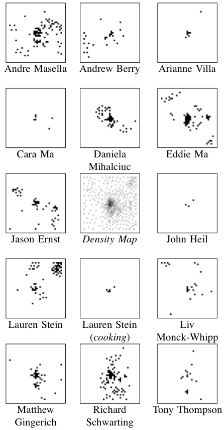 Results: The center image (in the collection to the left) is a density map where darker pixels indicates a larger number of posts — this centre map represents all of the posts made by all of the authors pooled together.
Because of the number of posts and the number of authors, I’ve exploded the single SOM image into the remaining fourteen images.
It was found that posts were most often clustered together if they were both by the same author and on the same topic. Clusters containing more than one author generally did not show much agreement about the topic.
Regions of this SOM were dominated by particular authors and topics as below.
| Region | Authors | Topics |
| Top Left | Liv | Academic Journals |
| Eddie | Software Projects | |
| Jason | Academic | |
| Top Border | Lauren | Human Idiosyncrasies |
| Richard | Linux | |
| Top Right | Lauren | Improv |
| Up & Left of Centre | Daniela | Travel |
| Centre | all | short and misfit posts |
| Right Border | Andre | Cooking |
| Just Below Centre | Matthew | Software Projects |
| Bottom Left | Andre | Language Theory |
| Andrew | Software Projects | |
| Jason | Software Projects | |
| Bottom Border | Richard | Academic |
| Bottom Right | Eddie | Web Development |
| Jason | Software Tutorials |
Discussion: There are some numerical results to go along with this, but they aren’t terribly exciting — the long and the short of it is that this project should to be repeated. The present work points towards the following two needed improvements.
First, the way the bitvectors were cropped at the beginning and at the end were based on a usage heuristic that doesn’t really conform to information theory. I’d likely take a look at the positional density of all bits to select meaningful words to cluster.
Second, all posts were included — this results in the dense spot in the middle of the central map. Whether these posts are short or just misfit, many of them can probably be removed by analyzing their bit density too.
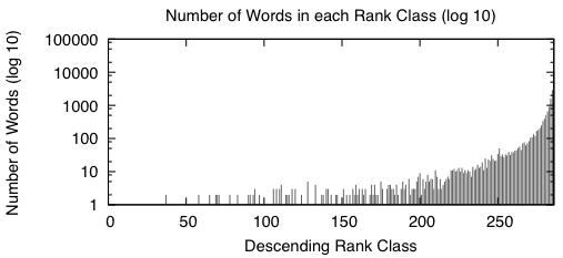
Appendix: Here are two figures that describe the distribution of the data in the word bitvectors.
 |
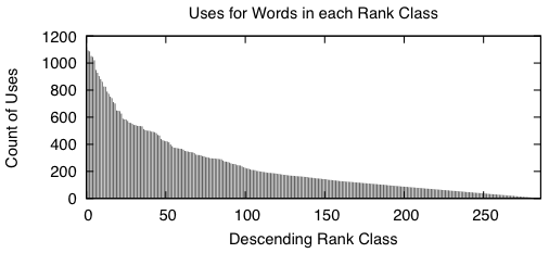 |
When we sort the words based from a high number of occurrences down to a low number of occurrences, we get graphs that look like the above two. A rank class contains all words that have the same number of occurrences across the entire study. The impulse graph on the left shows the trend for the number of unique words in each rank class. The number of words drastically increases as the classes contain fewer words. The impulse graph on the right shows the trend for the count of uses for words in a given rank class. The number of uses decreases as words become more rare.
These graphs were made before the main body of the work to sketch out how I wanted the bitvectors to behave — they verify that there was nothing unusual about the way the words were distributed amongst the data.
 Ed's Big Plans